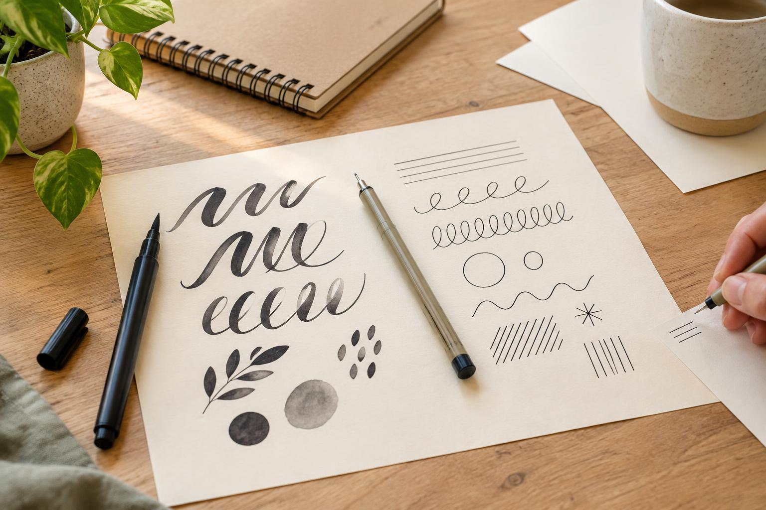
Start with the marks you want to make
Hand lettering is the practice of drawing letters with attention to their shape, spacing and style. You do not need beautiful everyday handwriting to enjoy it. A shopping-list word, a greeting card or a label for a storage box can all become small projects. The first tool decision is less about which pen is “best” and more about the kind of marks you want to make.
A brush pen has a flexible tip that can produce thin and thick strokes as your pressure changes. A fineliner has a firmer tip designed to make a more consistent line. Both can create attractive lettering, but they invite different approaches. Brush pens suit flowing letters with visible contrast between strokes; fineliners suit crisp outlines, compact details and styles you build up one line at a time.
What it feels like to use a brush pen
With a brush pen, you typically use light pressure for a thin upward stroke and more pressure for a thicker downward stroke. That change can give even a simple word a lively rhythm. The trade-off is control: a flexible tip responds to small movements of your hand, so your early letters may look uneven. Practising slowly is more useful than trying to write a whole sentence at normal speed.
Brush pens also vary. A small, relatively firm brush tip may feel easier to manage for short words than a large, very flexible one. If you are choosing your first pen in person, look for a tip size that matches the size you plan to letter. Trying to squeeze a broad tip into tiny letters can be frustrating. Use smooth paper where possible; rough paper can make strokes less predictable and may wear down a delicate tip.
Why a fineliner can be a comfortable first choice
A fineliner gives you a steady line without requiring pressure control. You can sketch a letter lightly in pencil, trace it, then adjust its shape with a second line. That makes fineliners especially useful for block capitals, outlined letters, patterns inside letters and small labels. They are also handy for planning spacing before you add color with another tool.
You can imitate thick-and-thin lettering with a fineliner, too. Write a word in a simple script, add an extra line along the downward parts of each letter, and fill in the spaces you have created. This is often called faux calligraphy. It takes more steps than using a brush pen, but those steps give you time to see where each thick stroke belongs. If clean edges matter to you more than a flowing writing motion, this may be the more satisfying place to start.
Let the paper and project guide your choice
Ordinary notebook paper is enough for rough practice, though ink may show through or spread on some sheets. Put a spare page underneath your work and test a corner before committing to a finished piece. Smooth paper is a useful choice for brush pens, while fineliners can work on many surfaces that do not snag the tip or cause ink to feather. Neither tool is automatically suitable for wet color layered over it; if you plan to add paint or water-based markers, test the combination first and let each layer dry.
Think about the size of your project as well. A brush pen can give a short card heading or poster word a bold presence. A fine-tipped pen may be easier for a bookmark, place card or small caption. You can also combine them: make a large word with a brush pen, then add a thin outline or decorative dots with a fineliner. Check that the inks do not smear together on your chosen paper before making the final version.
Try a small experiment before buying more
A modest starter setup is enough: one dark pen, a pencil, an eraser and a few sheets of smooth paper. If your budget allows, try one brush pen and one fineliner rather than a large pack of either. Draw the same word with both. For the brush pen, practise a row of light upward strokes and heavier downward strokes first. For the fineliner, draw the word as an outline or add thickness to selected downstrokes. Notice which process you want to repeat, not just which result looks tidier.
For a first finished project, choose a short word or phrase for a card and sketch its placement in pencil. Leave generous space around the letters, ink slowly and erase any visible guide marks only after the ink has dried. If the result feels too plain, add a border or a few simple shapes rather than buying another tool. As your preferences become clearer, you can choose your next pen for a specific purpose instead of hoping that more supplies will make practice easier.